2011 Shanghai, China
Shanghai International Design N. 1
CREDITS
Project leader: Arch. Joseph di Pasquale; Creative design group: AMLAB Joseph di Pasquale, Alessandro Tonassi, Nazareno Cerquaglia; Agnese Martinoli, Enea Pilastro, Matteo Ranghetti, Daniela Cipriani; AMSTAFF Rodolfo Sormani, Giuliana Santoro, Valerio Pozzi, Tommaso Pacchielli, Archie Juinio; AMCHINA Ma Jun (John), Zhang Hong, Ge (Mary), Yi Ji Xuan (Yves), Peng Hui Fang (Margaret), Cui Hong (Tracy), Ma Chong (Michael), Wang Ying (Vicky), Yang Honhy (Honhy), Zhong Nigo (Nigo), Song Kaidy (Kaidy); CONSULTANTS Sustainability: Stefano Valente, Structural engineering: Francesco Iorio, Rendering: Linrender
We have started thinking about this project from the words we have heard during the official competition meetings we have attended in Shanghai:
“The new project have will be inside Yangpu District, the new Project will be inside Tongji University, the new project will have an innovative design”.
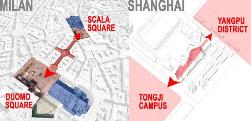
We studied about this phrase and we understood that our building should care very much the urban context and should have different approaches to it because the location and the fuctions will be in the middle between Yangpu district and Tongji Campus, between the city and the university.
From this phrase we’ve also learned that this building should not be an ordinary building but it should have a strong representative and symbolic architecture to represent innovation of design industry in this District which is the real capital of design in China.
We also have considered as a basic principle for our design that the final target for the investment is to rent the offices and commercial spaces on the market.
This meant that we had to avoid extreme design to try designing appealing spaces but with reasonable building costs, and minimize maintenace and operational costs.
This has affected our design decisions especially concerning the operational layout of the buildings, independence of the accesses, and the main materials and finishes.
CONTEXT ANALYSIS – ONE BUILDING THREE DIFFERENT URBAN APPROACHES
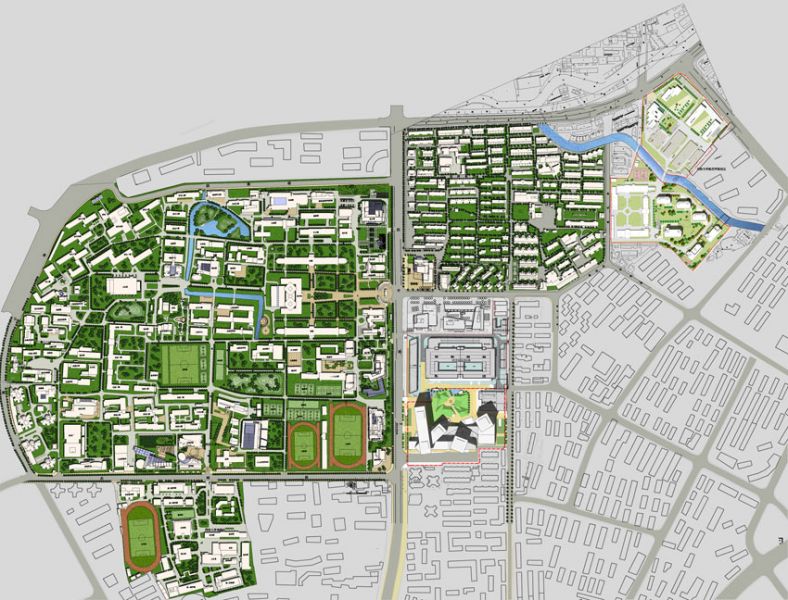
The site has three different relations with the urban surroundings due to three different urban scale of the context:
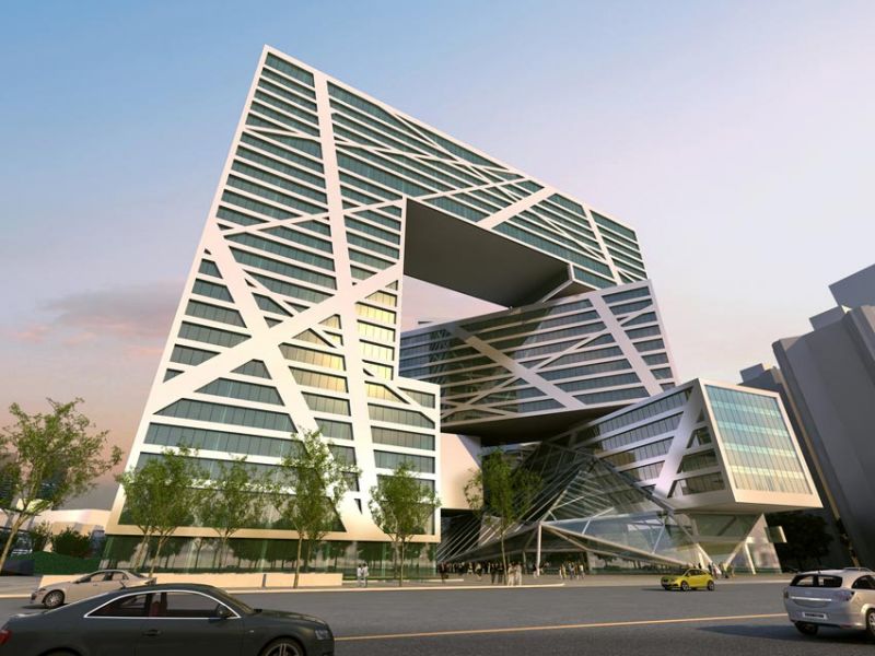
1) The first feature of the context is the Siping road. This side is facing west is the most important street bordering the site in terms of urban ranking. Siping road is the connection with the main City road network and is the most representative and simbolic stage for the new complex. This side is the official face of the building to the district and the entire Shaghai city.
We have called this approach: THE SIMBOLIC CREATIVE VALUE
2) The second feature is the relation with the residential texture on the south and on the east side of the site. On the south the site faces the north elevation of high residential towers.
This means that on this side we need to have a wide road and anyway the new buildings will not keep away the sun from the residences.
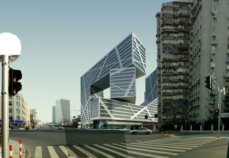
The east side facing Fuxin road is very important to establish a correct and proportioned relation with the existing buildings because the width of the road can not be changed and some existing building will be very close to the new complex.
We have called this approach: THE HUMAN SCALE VALUE
3) The third feature of the context is the connection with the inner life of the campus through the pedestrian tunnel that passing below Siping road and that connects the Tongji campus with the site.
We have called this approach: THE INTIMATE SPIRIT SPACE.
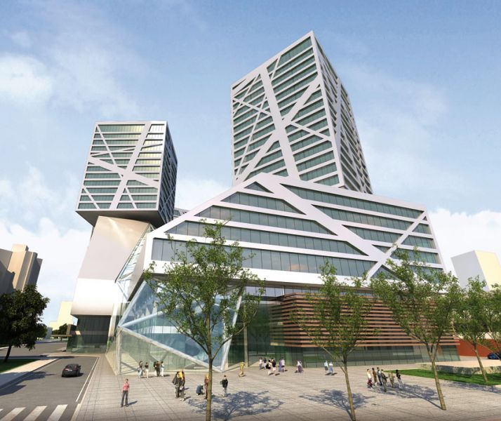
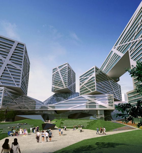
Then we started thinking about a building that could have a single identity but three different way to relate with the urban context: The symbolic value thoward Siping road, The Human scale Value facing the Fuxin road, and the intimate space facing the connection with Tongji Campus.
We have taken inspiration from the best of classical Italian architectural tradition: the PALAZZO DUCALE DI URBINO designed by Luciano Laurana in late XV century, which definetely is the most important Reinassance Palace in italian history of architecture.
Actually this building has three different faces but at the same time has a single strong own identity.
This building becames monumental and symbolic on the elevation facing the road coming from Rome. This was an advice to whom was arriving in Urbino: the city is strong and powerful.
At the same time the facade toward the city is completely different because of its lower facades and a more friendly and democratic feeling. Laurana used the idea of the “open book” for facades toward the city.
The core of the building is the most elegant and beautiful reinassance court yard in italy, the intimate and silent heart of the PALAZZO.
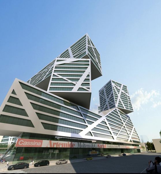
FACING SIPING ROAD: THE MARCO POLO GATE.
THE SYMBOLIC VALUE AND CULTURAL SUSTAINABILITY APPROACH
After the context analysis the main problem was to find a symbol for monumental Siping road front suitable for this project especially to match the expectation of the client for this complex to be a link between The design district in Shanghai and Italy.
We tought that this symbol had to follow the principle of CULTURAL SUSTAINABILITY, which meant that had to represent the link with Italy but also that it could be easily understood from the local culture.
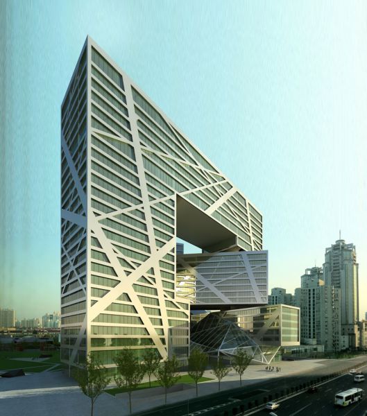
We wanted the viewer on this front on Siping road could immediately thought about a gate to enter the new complex but also a gate facing the west direction of the site, exactly toward Italy.
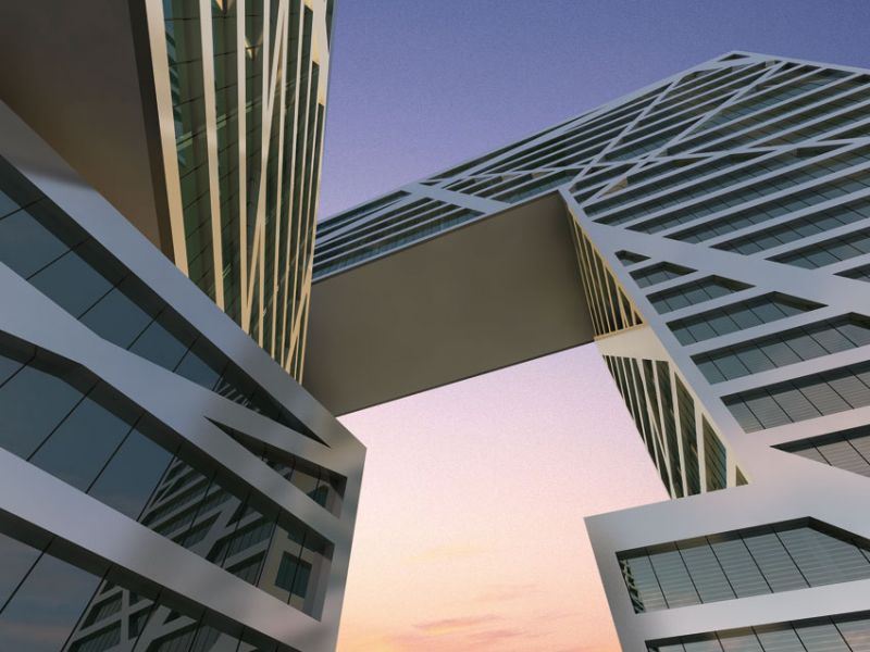
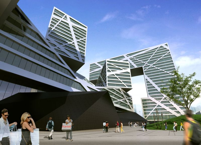
Then we designed a kind of giant semi opened gate. The gate is also a tipical chinese tradition, but we wanted that through our gate the people could travel along space and time till the first person who connected the two italian and chinese cultures: Marco Polo.
Since then for us Marco Polo was the culturally sustainable symbol for this project.
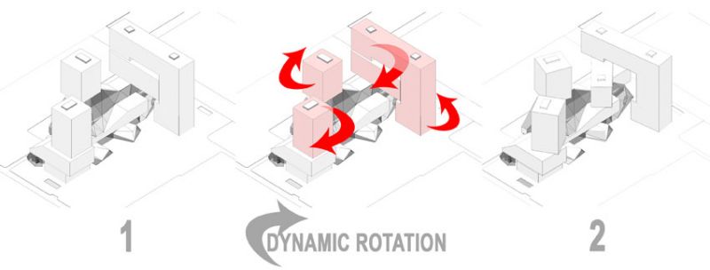
And the facade had to look like a giant gate freezed while opening to enter the design world and looking toward west and toward Italian tradition.
FACING FUXIN ROAD:
THE HUMAN SCALE APROACH.
Following the teaching of Urbino Palace, we have designed the elevation on Fuxin road reducing the main dimensions of the building parts. The heights are reduced and the main facades have been moved back from the road in order to create a little square which allows the viewers to include easily in their views the heights of the buildings and smoothly insert the new complex into the existent residential context.
FACING TONGJI CAMPUS: THE INTIMATE SPACE
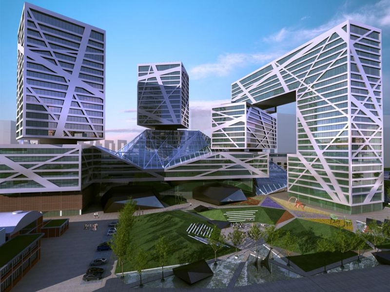
The pedestrian underground connection with Tongji Campus passing below Siping Road creates a different atmosphere just in the center north side of the site. This becames the central yard of the Tongji design district. We thought that a empty landscaped space was the best way to create a significant linking between the new complex and the existing buildings: the Tongji Design Institute Building and the Tongji Design Insitute.
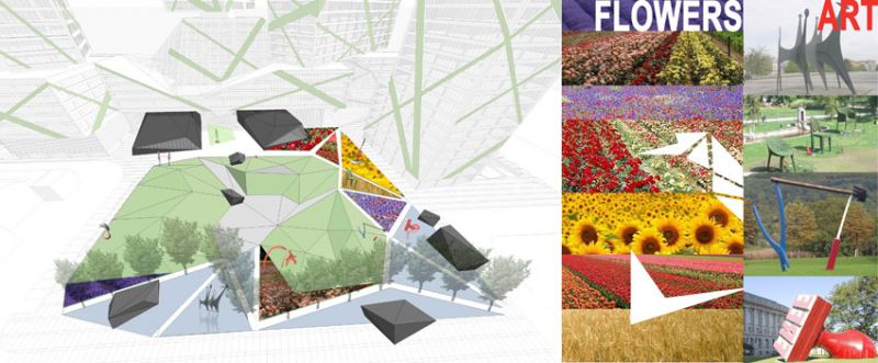
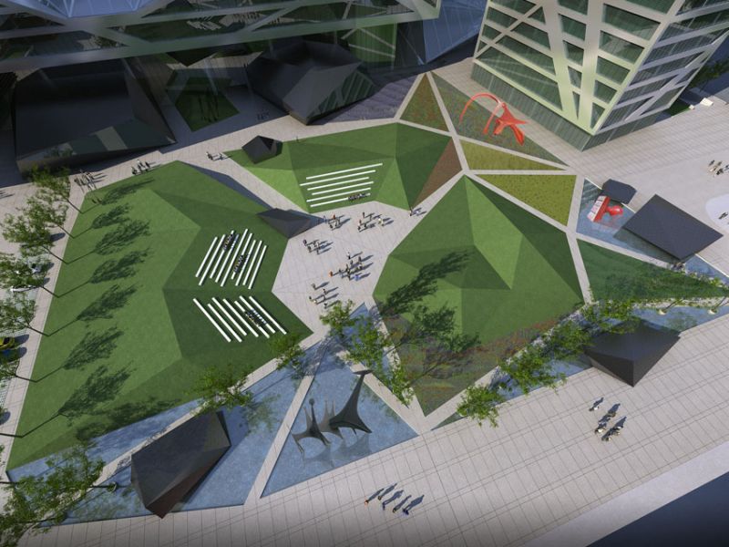
We designed this court yard just like the contemporary interpretation of the original Tongji campus atmosphere: a quiet and meditative space where is possible to think, have rest, and run shows and public events like sculpture and art exhibitions.
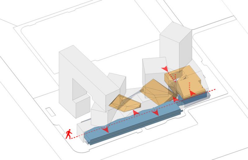
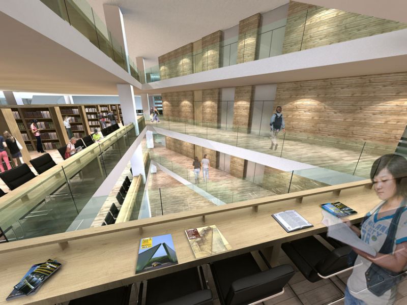
This space will be easily connected with the public educational functions like the creativity design museum, the design library and the show space.
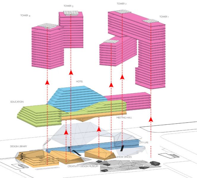
OVERLAPPING FUNCTIONAL LAYERS: MAXIMUM EXCHANGE AND MAXIMUM INDIPENDENCE.
The first problem we faced in studing the functional program of the briefing documents was the huge quantity of square meters required.
Then we need to find the way to clearly separate the functions but at the same time to create the best condition for integrate them toghether.
Them we design a system made of three overlapped layers of functions which create easy vertical conncection and relations between the different functions keeping a perfect indipendence.
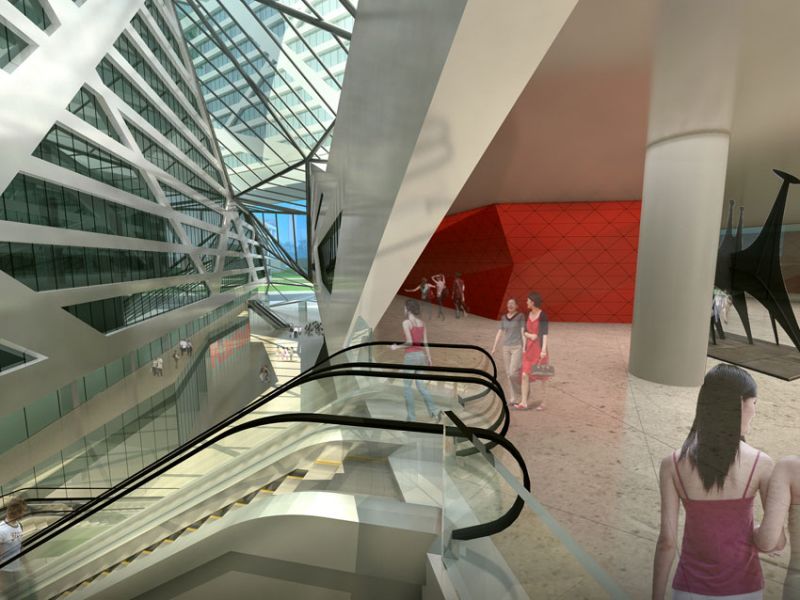
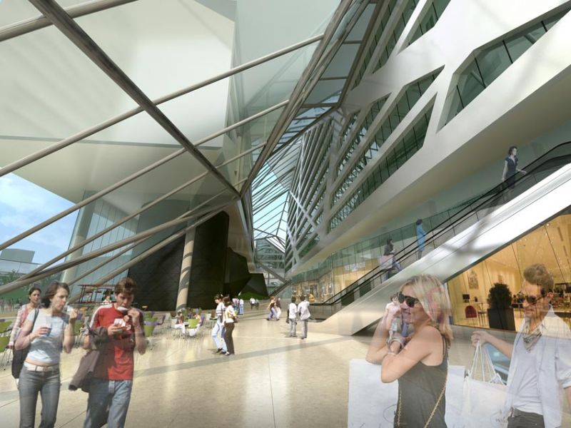
1) The first layer is the City Life and Exchange layer that is located on the ground levels. This layer manages the connection with the city, with Siping road and Fuxin road. Therefore we locate here the commercial function (city life), and toward the landcaped central courtyard have been located the main public spaces for education (creativity Exchange) like design library, design museum and show spaces. On the second floor we locate the restourants and other commercial activities.
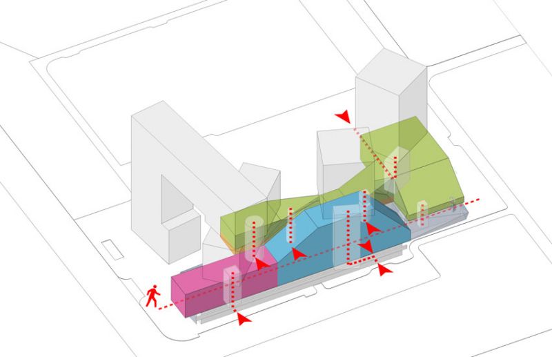
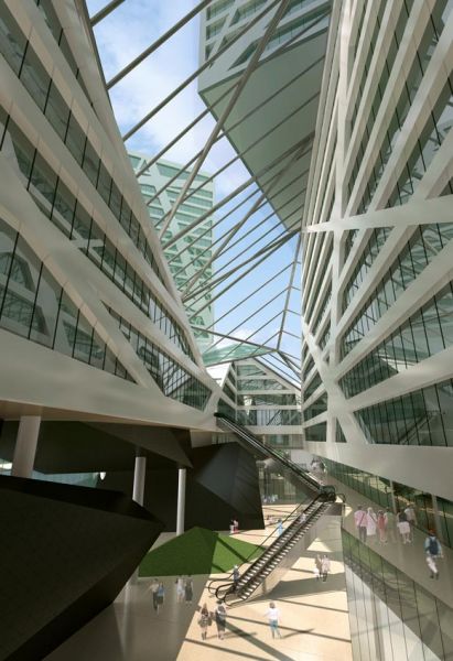
2) The second layer is the meeting and research layer wich includes the main research and educational activity, the hotel, and some part of creativity commerce more linked with the research activity. This level should be the perfect link and connection between the university, the city life and the office and design industries spaces located upward. In a wide middle floor with a higher interior height we have concentrated all the meeting rooms and main classroms. This space is also easily reachble from the ground floor due to a direct double escalator link. This allows also to locate here public conferences and important meetings.
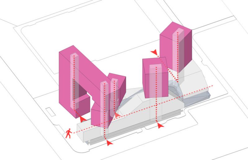
3) The third layer is devoted to the creativity commerce offices space which has been divided in four towers, to make more simple the adressing of the tenants. The most important feature of this function is that every tower has its own separate entrance that can be used also when all the others activities are not running and the other spaces are closed. This allows to reduce and easily separate the operational costs for the tenants. Some special height floors are devoted to master offices space wich can includes also large meeting rooms or small lectures halls.
ITALIAN DESIGN STREET AND GALLERIA MATTEO RICCI
One of the requirements of the competition concerns the Italian Design Street, which is included also into the District Planning Regulation as a specific place for a special commercial purposes connected with italian design industry and culture.
We have located the Italian Design Street along the new road on the south boundary of the site, but this street unfortunately, due to some existing residential buildings, can not reach in a proper way the Fuxin Road.
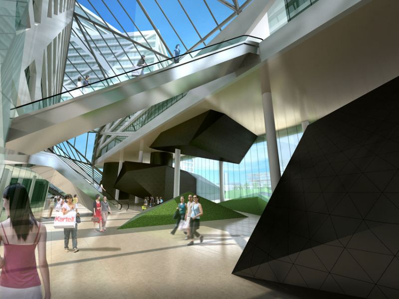
Therefore we decide to create a real connection from the Siping Road and Fuxin road moving it inside the complex and using the italian concept of GALLERIA which is a covered pedestrian commercial street placed in between two buildings. We have beautiful samples of this kind of elegant comercial street in Italy. The special atmosphere inside this gallerie is a confortable mixing between urban open air space, and commercial indoor space.
We have the GALLERIA VITTORIO EMANUELE in Milano, The GALLERIA ALBERTO SORDI in Rome, and th GALLERIA UMBERTO I in Naples.
We would like to name this new place GALLERIA MATTEO RICCI.
Next to Marco Polo we have choosen the historical figure of Matteo Ricci because he also was a person who deeply knew both italian culture and chinese culture, especially in science, philosophy and theology.
Starting from his italian culture he tried to merge it with the Confucian philosophical approach into a new and higher view of the world, selecting the best and the truth in both of them.
LANDSCAPE CONCEPT: NATURE BECAMES ARCHITECTURE
For the lanscape concept we started from the idea that the gardening should not be just a filling of the forgotten empty spaces between the buildings. We think that it has to be a fully designed open space. It should be the key link element between the exhisting buldings and the new buildings.
The landscape design philosophy is a merge between the italian garden style and the chinese garden style.
In Italian Garden style the geometry is the instrument that the man uses to shaping and dominate the nature. Therefore we have designed a land art installation where geometry actually gives the shape to the fields and the grass hills.
The chinese garden is an Harmonious symphony made of nature, architecture, natural elements like stones, but also poetry and painting.
And we have learned just from the chinese paintings how to link the landcape concept to the architecture in a unique ensemble.
The energy of the drawn lines in Xu Wei's paintings has been the inspiration for us to create a crossed force lines pattern which has been the grid to link all the design of the project: from the landscape to the facades of the entire complex.
The landscape shapes grow toward the building and became giant objects, buildings and spaces for museum and exhibition invading the interior space of the galleria.


