2012 Milan, Italy
Competition for the service architectures in Milan - Expo 2015
IDENTITY AND DISCRETION
The national pavillions must legitimately dominate the Expo's landscape.
The service architecture must be a kind of "basso continuo" in visual perception.
Therefore the challenge is to contribute to candidate these architectures in Oscar for "best architectural actors in supporting roles."
MODULAR CORE AND UNITARY SKIN
The general approach to the secvice architectures was to identify a single tipology construction and a single system of functional modularity adaptable and flexible to meet all possible requirements set by the functional program mix.
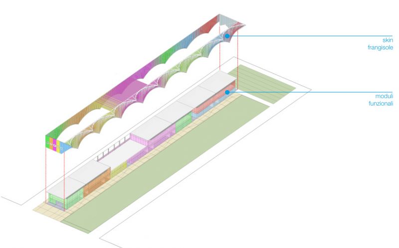
This modularity is based on repetitive and serial elements which contrasts with a dress that tends to reduce repetition and to redefine the overall image of the sticks as continue installation.
RELATION WITH EXPO LANDSCAPE
Different fronts of service architectures are designed according to different functions and design targets.
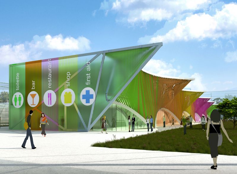
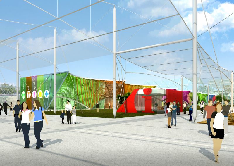
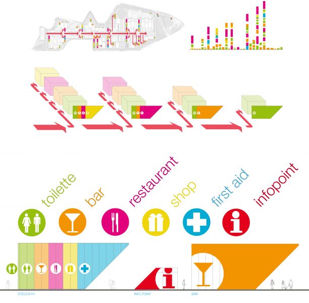
The front looking on World Avenue is a graphic summary of the activities contained in the stick.
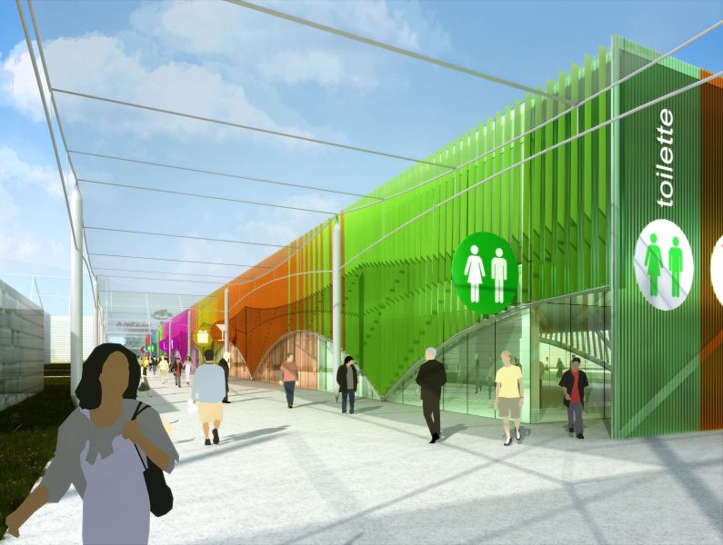
The long side toward the awning has the secondary function of access to the various activities by providing indications about their position.
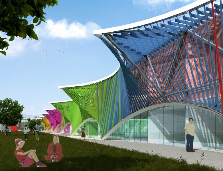
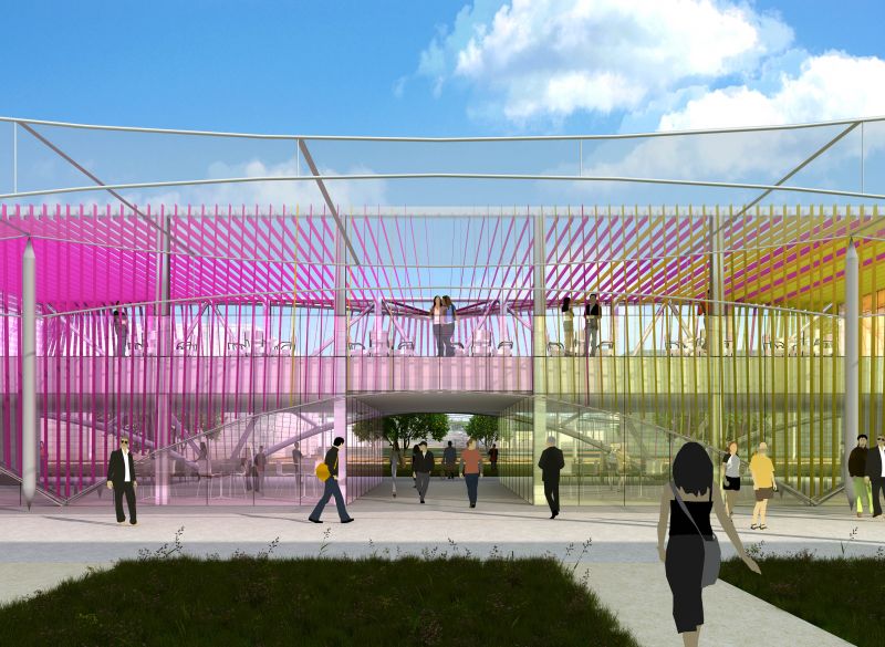
The side facing the Hortus has function of shading and transparent relationship between the various activities and adjacent open space. This front presents a distinctive identity and transforms the repetitiveness of the functional modules in an organic element perfectly related with green Hortus spaces.
DETECTION AND RECOGNITION
Two levels of "identification" were analyzed to design service architectures:
The first level of recognition has as its objective to underline the presence of a service architecture regardless of the function contained. For this reason, the focus was on two aspects:
Recognition technology: It was adopted by a technology easily recognizable facade consists of bands obtained with sunscreens nylon fabric stretched vertically up the sides of the constant of the finish on the long sides. This type of finish very recognizable should immediately summon the service functions as well as being akin (as tissue) with the material of which will be realized sun awnings also immediately related to public office.
Recognizable geometric pattern using the set of arcs on the pitch 20 meters borrowed from geometry already used for awnings has tried to interpret what is already a geometric mentally connected to the main routes. The continued presence of these arches and reassuring to step very long should be the "foundation of vision" of the experience inside the Expo.
The second level of recognition concerns the ability to easily locate the individual functions within the architecture of service. To achieve this, we focused on two aspects:
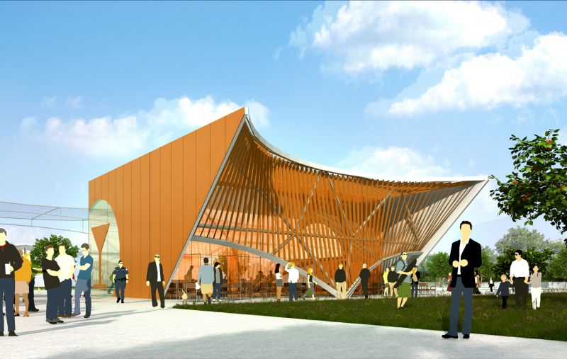
The extension of the color code used on signs that the entire building itself becomes a huge panel signage based on the color code related to the functions. Each color is mapped to a function that then extends to the gradation of the glass facades of the building, and possibly the same interior fittings, furniture, etc..
The definition of simple and immediate functions through the fewest possible number of logos with pictograms simple and universally attributable to functions contained. The use of color and pictograms should be completely and overwhelmingly sufficient to identify the functions. The use of a few written in English in the world heads toward the avenue has only one function and strengthening it.
LAYOUT
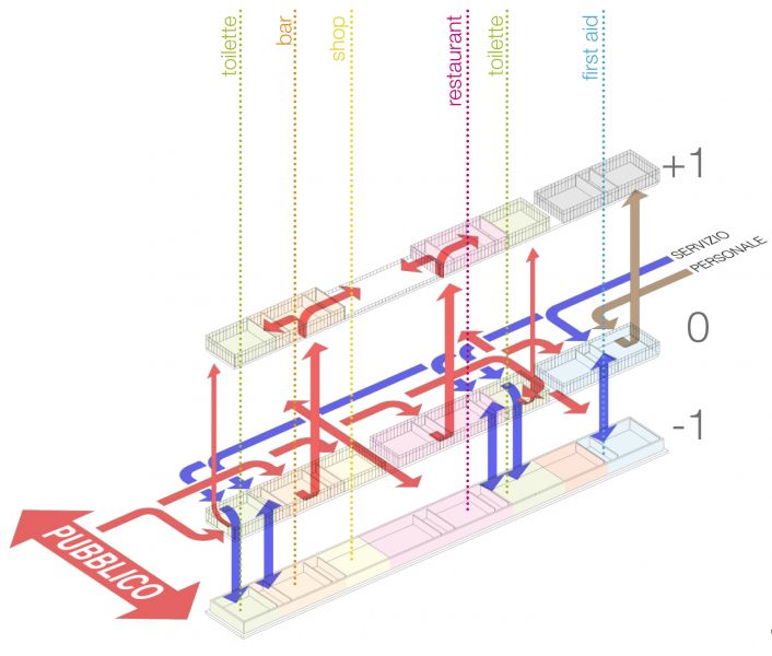
The inner functional layout is based on the step of the structural grid which is based on a step of five meters along the length of the slats and forty meters in width direction.
The scanning of five meters is further redistributed into "serving" modules interspersed with three "served" modules . We obtain an -a-bbb-bbb-a rhythm which is twenty meters as the awnings.
Each module is designed to be potentially repeated. It is therefore always the same. The scan allows the alternation of different functions in an orderly and interchangeable finding himself increasingly aligned with the pitch of the pillars of the awnings.
All accesses are designed mainly by the incoming path under the awning while the side that looks on hortus is thought bidirectional but predominantly output from the internal spaces of the functions of service to the outside in particular as regards the dining areas, bars and commercial spaces.


