2020 Comune Pisogne , Italy
COMISA Headquarters
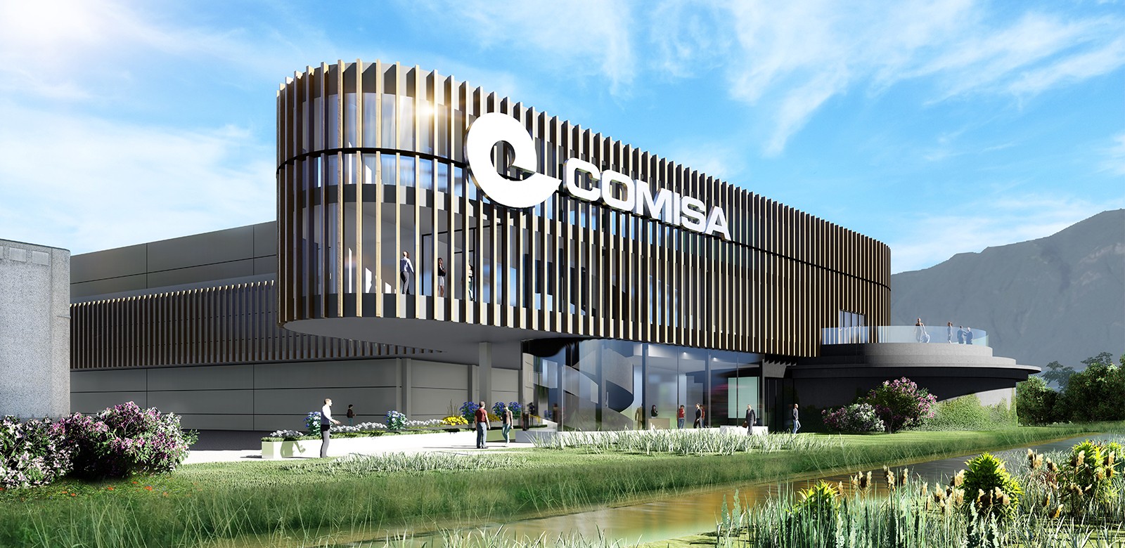
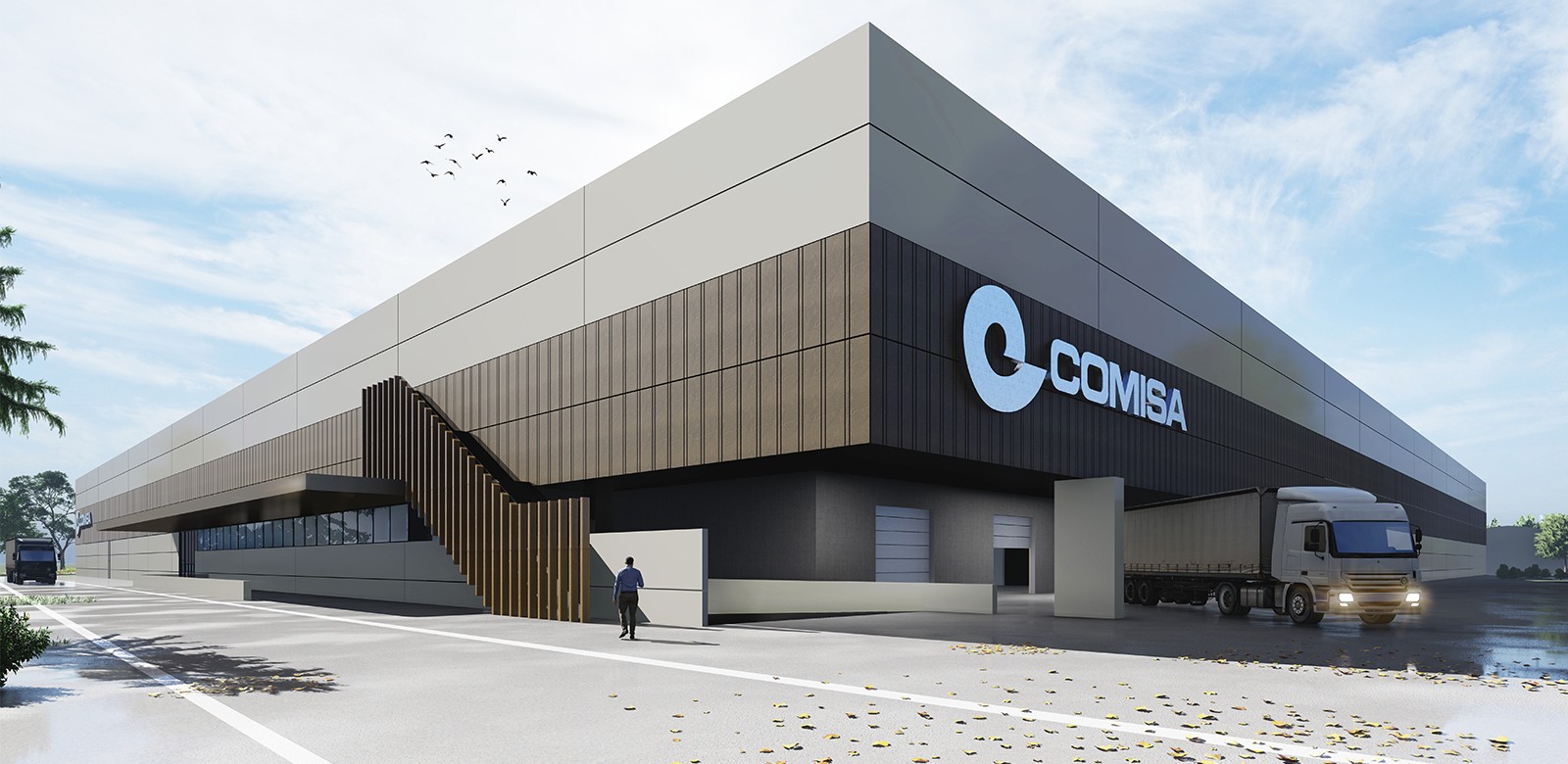
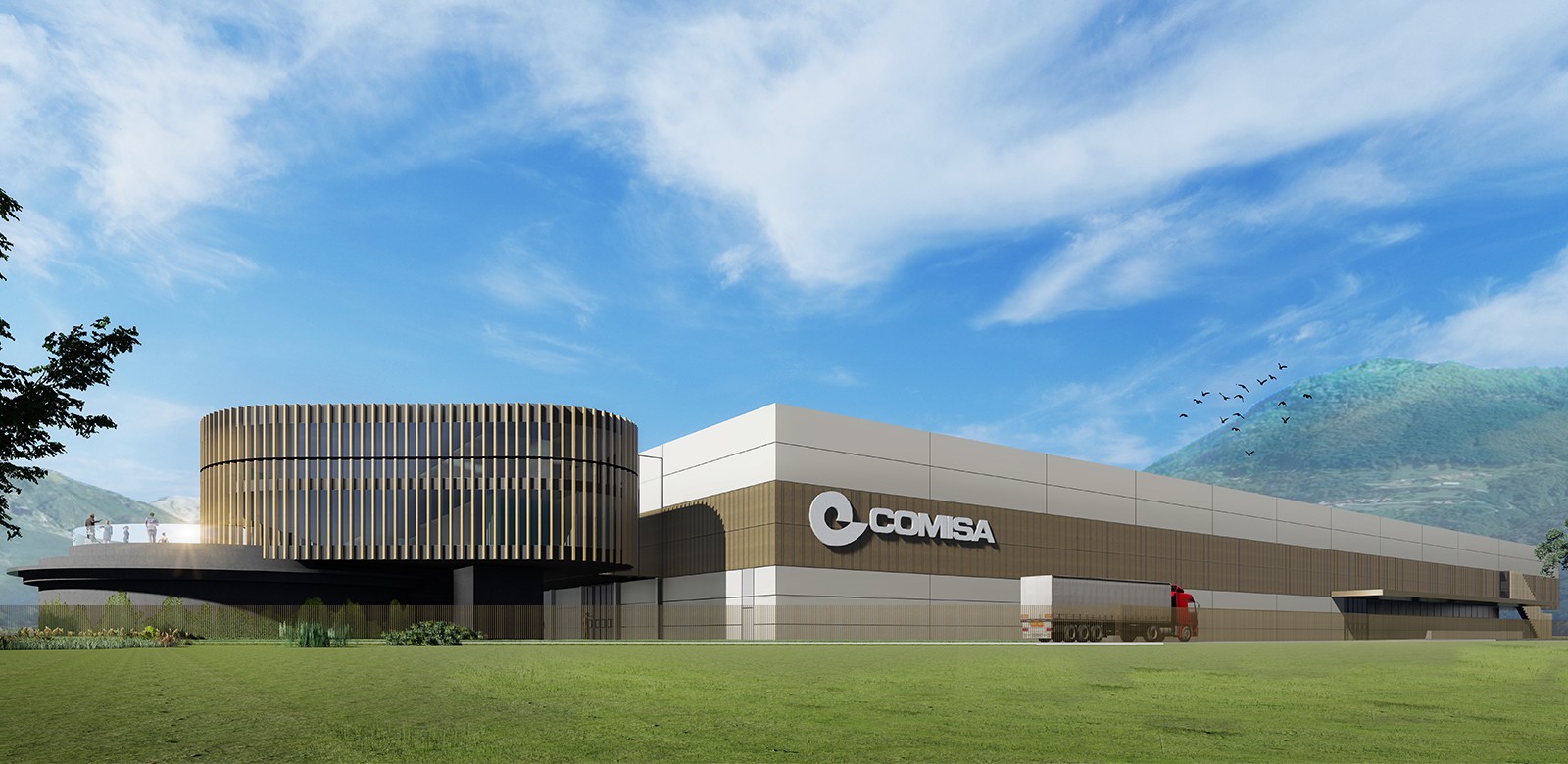
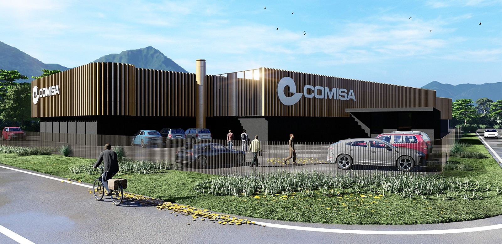
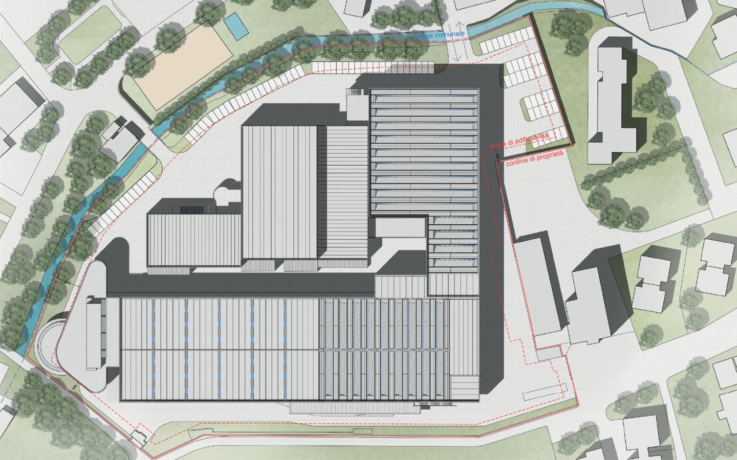
The vaguely triangular shape of the office building derives from the natural conformation of the lot. Respecting the alignments of the lot means creating visuals that harmonize well with the context as well as maximizing the openings towards the surrounding landscape, guaranteeing more natural light and greater comfort and internal well-being. The sunscreen cladding in tubular metal with a wood-effect surface finish also helps to ensure greater internal comfort, avoiding direct radiation on the glass. In addition to a functional role, umbrellas allow you to standardize the visual image of offices and factories, which have a horizontal band of the same burnished color. The cistern, said by the saying that it will serve as an exhibition space on the ground floor, will also be used to create a terrace on the first floor on which the canteen area will overlook. The company logo has already been designed and positioned so that it harmonizes well with the architecture, avoiding false posters or paneling. Both measures contribute to the cleanliness and linguistic homogeneity of the project.
The materials chosen aim to create a uniformity of language between the existing building, the new office building and the new factory. The project involves the use of colors that harmonize with the context, echoing both the gray color of the building it approaches, as well as the brown color and the wood to recall the colors of the earth and the surrounding mountains. The use of the vertical brise soleil, later recalled 6. Architectural language from the false rhythmic joints of the factory panels, wants to evoke the image of tree trunks.
Architecture, Interior design: JDP ARCHITECTS (Joseph Di Pasquale, Paolo Labbadini, Diana Ranghetti, Carlo Caserini, Paola Sacchi) - STUDIO SPATTI (Giorgio Spatti)
Logistic and data consulting: STUDIO FARRI (Roberto Farri)


